Recently, I decided to give Mahou Shoujo Madoka Magica a watch, since it was written by Gen Urobuchi, who also wrote Psycho-Pass, my second favorite anime ever. I absolutely loved it, but it wasn't actually Urobuchi's writing that caught my attention. It was the art direction. It had such a unique feel to it, and I don't think I've heard much in praise of it. The more I thought about it, the more I realized that art design really isn't discussed much when it comes to anime, which is odd considering how much more important it is to good ol' Nippon than it is in the west, generally speaking. So, I thought I would outline a couple design elements that I personally think are really important, and don't get as much discussion as I'd like.
Using color design to give atmosphere
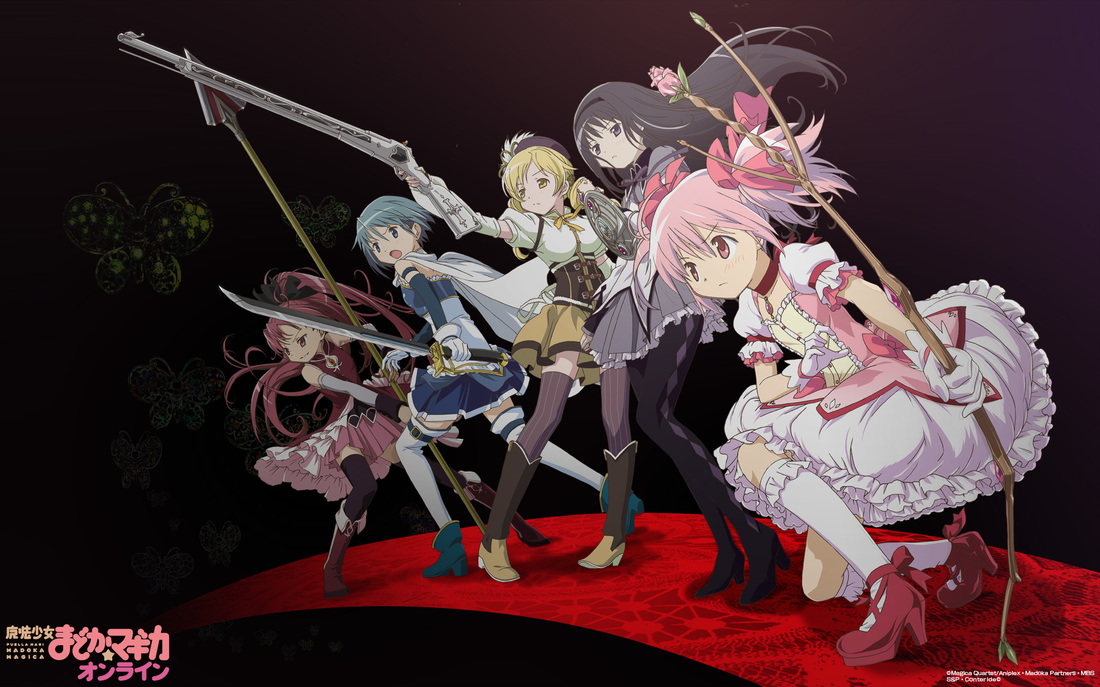
When watching a show, the average person rarely thinks "wow this is a nice color scheme they've got going huh", but it's very important to setting the mood for a scene, location, or even an entire series. There's the obvious usage variants of different landscapes having different color schemes, such as dark blue nights and bright red volcanoes, but that's pretty simple when compared to its potential. Leveraging this over an entire series could have significant purpose, such as with Madoka Magica, which has a deceptively cute art style to mislead uninformed viewers, which is only strengthened by its pastel color palette.
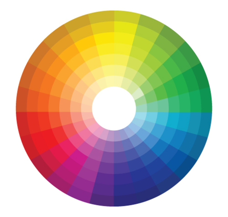
Pictured above is- wait, that's not an anime!
Now, the basic idea is that each color has different values. Saturation, warm or cool, value... each of these can be individually tweaked to drastically change the feeling of a color. When you factor in all the colors on screen at once, theming them well can achieve great effects, and selecting poorly could absolutely destroy the style. It's no science, but oversaturating or poor balance could really turn a great looking show into a really ugly one. It's important to have a consistent palette throughout a shot, and many times it works really well when extended over longer periods.
A great example of this extending over an entire show is Tamako Market. The show as a whole has a very lighthearted atmosphere, and its vibrant colors are a key part to it. The Usagiyama Shopping District is a very exciting place, and it's made so by the colorful decorations, along with the characters within it. However, the sequel movie, Tamako Love Story, takes an entirely different approach to color. As a romance between childhood friends with frequent flashbacks, it opts for a more nostalgic color scheme. The colors as a whole are more subdued, with the usually vibrant shopping district appearing more realistic. Some scenes have desaturated palettes reminiscent of old films, while others have a very warm feel, with the sun setting in the background. All of the schemes used make for beautiful scenes, and they all work excellently with the main themes of the movie.
A great example of this extending over an entire show is Tamako Market. The show as a whole has a very lighthearted atmosphere, and its vibrant colors are a key part to it. The Usagiyama Shopping District is a very exciting place, and it's made so by the colorful decorations, along with the characters within it. However, the sequel movie, Tamako Love Story, takes an entirely different approach to color. As a romance between childhood friends with frequent flashbacks, it opts for a more nostalgic color scheme. The colors as a whole are more subdued, with the usually vibrant shopping district appearing more realistic. Some scenes have desaturated palettes reminiscent of old films, while others have a very warm feel, with the sun setting in the background. All of the schemes used make for beautiful scenes, and they all work excellently with the main themes of the movie.
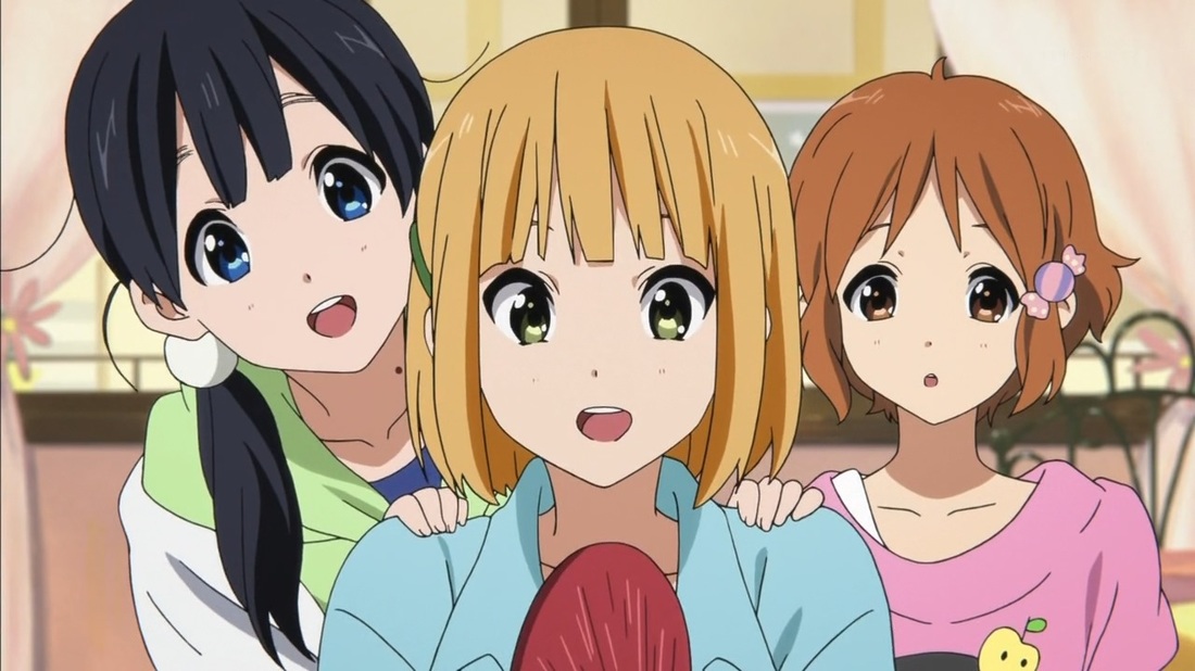 |  |
Tamako Market on the left, Tamako Love Story on the right.
Designing settings with purpose in mind
Many shows coming out nowadays have very uninspired settings, such as our lord and savior Digibro's new punching bag, The Asterisk War. It seems that a lot of them just mash together elements that seem cool without much reason or thought put into it. It seems the Urobutcher is back to put those settings in their place, as Psycho-Pass is an excellent example of a dystopia with great thought put into its technologies. Other than obvious things like the adoption of more self-driving cars and touchscreens, every leap in technology says something about the future's issues. The Sybil System and Dominators are the obvious ones, but the holographic rooms show how people have become distant with the real world, cybernetics and personal assistants are making people somewhat lazy... the list goes on.
However, rules like these don't just apply to science fantasy. In fact, an even better example of this type of setting devotion is K-On. (K-On, you say?!) Believe it or not, K-On goes to great lengths to create a realistic environment, to the point where most outdoor places throughout the show are exact copies of real places in Japan (and London if you include the movie). It all has purpose, of making the locales of the show believable, which along with the amazing characterization, keep everything grounded in reality. Slice of life shows don't always have very interesting settings, but the sheer amount of detail in K-On's otherwise normal school makes it something truly memorable.
However, rules like these don't just apply to science fantasy. In fact, an even better example of this type of setting devotion is K-On. (K-On, you say?!) Believe it or not, K-On goes to great lengths to create a realistic environment, to the point where most outdoor places throughout the show are exact copies of real places in Japan (and London if you include the movie). It all has purpose, of making the locales of the show believable, which along with the amazing characterization, keep everything grounded in reality. Slice of life shows don't always have very interesting settings, but the sheer amount of detail in K-On's otherwise normal school makes it something truly memorable.
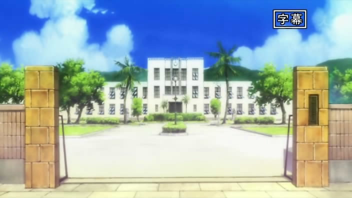 | 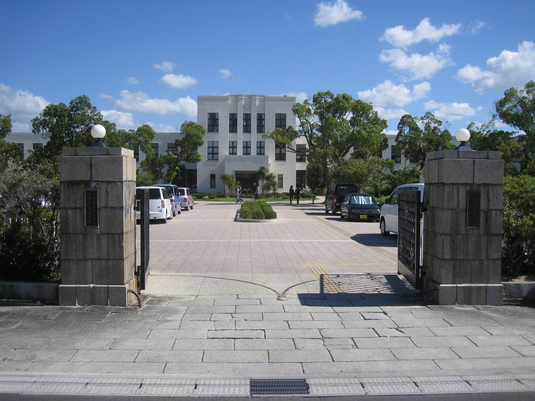 |
K-On! on the left, Real Life on the right
Hope you guys enjoyed me talking a bit about visual design for a change. It's not something I see get attention very often. Anyways, It's like 11:30 at night and I barely made my deadline this time. Maybe I should prepare a topic before the day of next time. So this is your captain, signing off.
 RSS Feed
